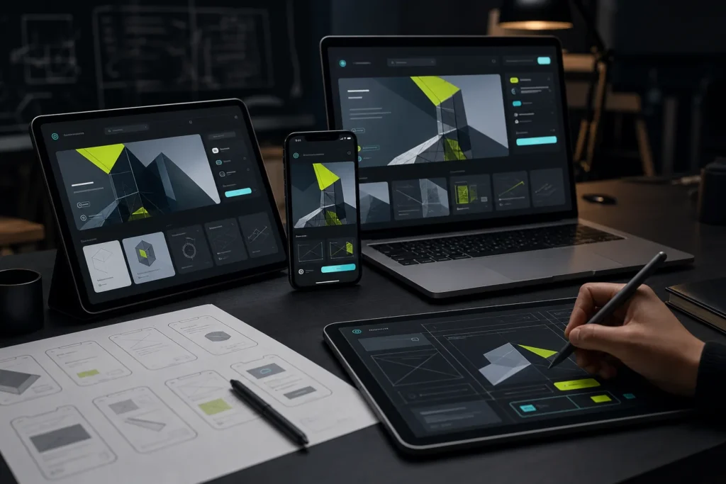
Visitors decide within seconds whether your website is worth exploring. Clear navigation is one of the strongest signals that they’re in the right place.
Principles that work
- Keep menus short. Five to seven top-level items is easier to scan than a long list.
- Use plain labels. “Services” beats clever wording visitors have to decode.
- Put the main action in view. A clear “Get started” button guides people toward the next step.
- Design for thumbs. On mobile, make tap targets large and keep key links within easy reach.
- Show where people are. Highlight the current page so users never feel lost.
Test, don’t guess
Watch a few real users try to complete a task, such as finding pricing or booking a call. Where they hesitate or click the wrong link, your navigation needs work. Small fixes, like renaming a menu item, often make a noticeable difference. The Nielsen Norman Group offers practical guidance on testing navigation.
Our UX audits and UI design uncover friction points and turn them into clear paths that lead visitors to act.
Ready to grow? Explore Schlege Labs services or see our recent work — then let’s plan a website that turns visitors into clients.